Box Office closes 1 hour prior to posted closing time. Last admissions to the Museum: NOV-FEB 9 p.m. | MAR-APR 10 p.m. | MAY-AUG 11 p.m. | SEP-OCT 10 p.m.
Opening times this week:
Monday
6pm - Midnight
Tuesday
6pm - Midnight
Wednesday
6pm - Midnight
Thursday
6pm - Midnight
Friday
6pm - Midnight
Saturday
6pm - Midnight
Sunday
6pm - Midnight

Exploring the Neon Color Palette and What These Hues Meant to Old Vegas

Las Vegas has always been a city of spectacle. Long before the LED billboards and digital projections of the modern Strip, color reigned supreme through the flicker and flash of neon signs. From the Strip to Fremont Street, glowing hues like hot pink, turquoise, and electric yellow were deliberate choices that helped create the city’s mystique, excitement, and unmistakable brand.

Today, many of these historic signs live on at The Neon Museum, where they serve as glowing reminders of the art and psychology behind color in neon. Let’s explore what these colors meant, and why they mattered.

COLOR AS CHARACTER IN OLD VEGAS

The color palette of vintage Las Vegas wasn’t random. Casinos, motels, lounges, and restaurants used neon to communicate with travelers in an instant and before they ever stepped foot inside. The right color could hint at exclusivity, relaxation, romance, excitement, or energy. In a city where competition for attention was fierce, color became shorthand for personality.

Back in the mid-20th century, artists and sign designers working with companies like YESCO blended marketing savvy with design intuition.1 Their palette choices were informed by pop culture, fashion trends, and even advances in neon gas technology.

While there were hundreds of signs across Las Vegas, a few key colors emerged as icons of the era.

HOT PINK: FLIRTY & REBELLIOUS

Nothing says “Vegas” quite like hot pink.

This bold, saturated hue was a favorite of many casinos and showgirl venues. More than just eye-catching, hot pink had a layered meaning. It was playful and flirtatious, yet daring and rebellious.2 In neon, hot pink became a beacon for glitz, nightlife, and a bit of mischief.

The Flamingo Hotel, one of the Strip’s earliest resorts, helped solidify pink as a Las Vegas signature. Though its original sign featured more classic red hues, the Flamingo Ball became associated with pink neon across the city. Later, clubs and cocktail lounges would adopt hot pink to signal glam, femininity, and seduction.

In The Neon Museum’s collection, pink can also be seen in signs like the Debbie Reynolds relighting and the Moulin Rouge sign, evoking a time when Vegas was the ultimate escape for romance and risk. We also light up our welcome center, made from the historic La Concha Visitor’s Center, in hot pink.

TURQUOISE: COOL COMFORT & ATOMIC OPTIMISM

While hot pink screamed for attention, turquoise was more subtle and created a cool, calm, and welcoming vibe.3 This mid-century favorite was especially common among motels and diners that wanted to convey a sense of relaxation, modernity, and Western hospitality.

On signs, turquoise often balanced brighter hues like red or orange, creating a dynamic and harmonious palette. The Tropicana sign, whose turquoise-accented sign is a favorite at The Neon Museum, embodies this era’s aesthetic of being hopeful, stylish, and distinctly American.

ELECTRIC YELLOW & GOLD: ENERGY, SUNSHINE, & LUCK

Electric yellow is neon’s equivalent of a drumroll: bright, thrilling, and impossible to ignore. It was used to encourage action, whether inside a casino, under a marquee, or atop a bustling restaurant. More than any other color, yellow was designed to spark curiosity and movement.4

For Vegas, yellow and gold symbolized energy, money, and sunshine. In a city built on chance, it was a perfect match. Casinos like the Golden Nugget and Binion’s Horseshoe still use yellow and gold tones to suggest prosperity and luck, while other businesses adopted it simply to light up the night with warmth.

Today, visitors to The Neon Museum can see remnants of electric yellow on signs like Fitzgeralds or the Hard Rock guitar, capturing that relentless momentum Vegas is known for.

THE SCIENCE BEHIND THE GLOW

Back in the day, neon signs were made by filling glass tubes with gases like neon or argon. Different gases and phosphor coatings produced different colors.5 For example, pure neon gas glowed red-orange, while a mix of argon and mercury with special coatings could produce greens, blues, and purples.6

This technical artistry allowed sign makers to expand the palette and push the boundaries of what signs could communicate. Over time, custom-blended colors like pink and turquoise became not just aesthetic choices, but signatures of Las Vegas style.

WHY THE PALETTE STILL MATTERS

Preserving these colors today is about nostalgia and storytelling. Each hue in the Museum’s collection speaks to a moment in time, a mood, a business’s brand, or a broader cultural shift.

The Neon Museum continues to restore and preserve these signs with an eye toward authenticity, ensuring that the vibrant spectrum of Old Vegas continues to shine for future generations.

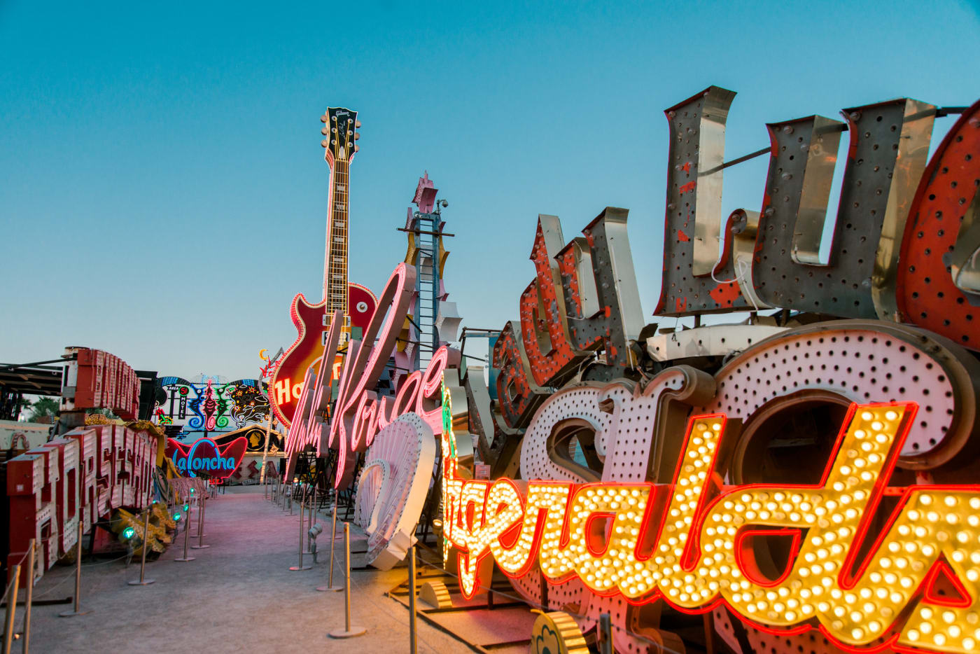
SEE THE NEON YOURSELF

When you visit The Neon Museum at night, it’s like a walk through color. The pinks still flirt, the turquoise still soothes, and the yellows still blaze with confidence. Want to experience the beauty of neon for yourself? Come visit The Neon Museum today!

Sources:
  1. YESCO. (n.d.). History. https://www.yesco.com/history/
  2. Silber Consulting. (n.d.). Neon pink: A bold choice in design and branding. https://silber-consult.com/neon-pink-a-bold-choice-in-design-and-branding/
  3. Ignyte. (n.d.). The psychology of color in branding. https://www.ignytebrands.com/the-psychology-of-color-in-branding/
  4. Imagibrand. (n.d.). The psychology of branding with the color yellow [Infographic]. https://imagibrand.com/the-psychology-of-branding-with-the-color-yellow-infographic/
  5. Neon By Design. (n.d.). The history of neon signs & LED neon signs. https://neonbydesign.com/the-history-of-neon-signs-led-neon-signs/
  6. Neon Signs Now. (n.d.). Brightest neon light signs: Colors & gasses guide. https://www.neonsignsnow.com/guides/brightest-neon-light-signs-colors-gasses